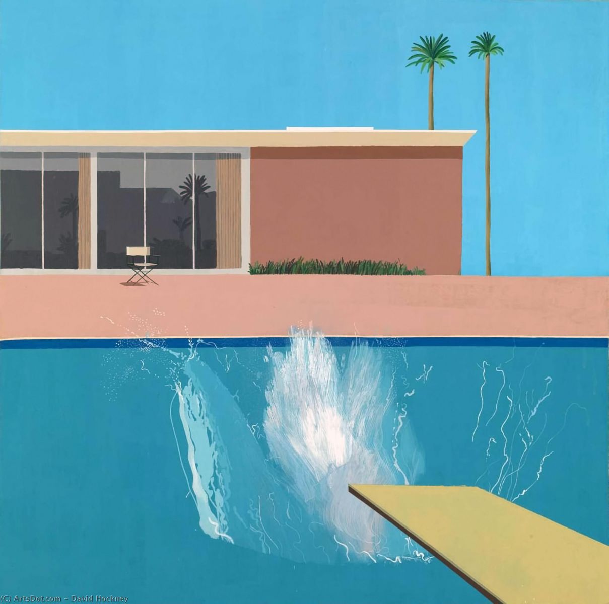
A Bigger Splash David Hockney 1967 Tate Britain
June 2023
Hockney’s famous painting ‘A Bigger Splash’ is commonly regarded as the depiction of the new, idyllic Californian lifestyle he was experiencing: a perfect blue cloudless sky, perfect blue swimming pool, a stylish, modern house, some elegant palm trees and a life of untroubled leisure.
But if find it totally depressing. I spent a while in front of it in Tate Britain and experienced a growing sense of emptiness and loneliness. Where does the loneliness come from?
Firstly, there is only one chair on the veranda. It is conspicuous with the diagonal lines of its frame and its neat shadow. Indeed, that is almost the only shadow in the entire painting. But there is no newspaper lying next to it. No open novel, no suncream or cup of coffee: nothing that would usually occupy our time spent in the sun. It is a very lonely chair.
Even the palm trees and thin strip of foliage look lonely. Not much biodiversity there!

Then there is no one in the swimming pool. We are asked to assume that someone has just dived off the board, but there are no ripples on the surface of the pool; no body visible under the water; no sign of any bounce, spring or vibration of the diving board. I don’t believe that anyone has dived in!
Adding to the loneliness is Hockney’s use of paint. Disregarding the splash itself for the moment, there are no signs of brushwork on the flat areas that denote the pool, the sky, the veranda or the house. Those surfaces are absolutely flat. As is the beige coloured surrounding of the image. No hint of a brushstroke to be seen. They are totally depersonalised surfaces.
We read the veranda and pool as a horizontal spaces, the house wall as vertical and the sky as a distant space, but there is nothing in their treatment that indicates them as such. Those are just our assumptions.
(There are two tiny exceptions to this. If you visit the painting, look out for 2 tiny dots of blue on the painted beige surround. Not mistakes. Quite deliberate imperfections. Rather like the imperfections that have to be included in a Turkish carpet or an Islamic ceramic to indicate that only God can produce perfection. Just a little tease by Hockney?
So what of the splash itself? Well, it’s not much of a splash! It’s not a representation of water. Water doesn’t behave or look like that. There really should be ripples and waves radiating from the entry point. But here at last is our sign of humanity. A human holding the brush is expressing himself in the white paint of the supposed splash. Anger? Frustration? Whimsey? Delicacy combined with brutality? Emotion at last! A human presence but not in the painting. In front of it.
For me, though, the emotion is not one of happiness or fulfilment. Here is an idyllic, Californian world devoid of humanity and soul. It is a depiction of spiritlessness. Which I why I include it in this Parish Magazine: the Christian challenge to a life of such material comfort and affluence is, ‘Where is the spirit?’ ‘What soul lies at the heart of life you have chosen?’
